
Ok Britain, we need to get it together. We’ve spent the last couple of years arguing with each other about what happened on one day in June 2016. There are some fundamentals that we need to figure out. Who are we as a nation and what makes us distinct from the rest of the world? What do we have in common as individuals and as citizens? How does that play out in a global world and in our everyday lives? If these important conversations are left to the politicians, then many people, including younger people, may be left out.
This project draws together individual experiences and insights gathered from a year-long consultative process, which we have used to create a series of brand identities and visual products which represent modern Britishness. We explore how the use of different verbal and visual languages can articulate perspectives from a range of geographical and cultural backgrounds, and what representations of visual identity can reveal about national identity and belonging.
The collection invites others to consider how debates about national identity can engage young citizens, and aims to stimulate further conversations about who we are as a nation, and how we celebrate both what is common and what is distinctive between people from across the UK.
Rebranding Britishness is a collaboration between Common Vision and Laura Gordon.
Supported by Sky Arts ART 50
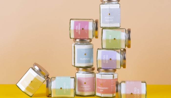
Cultural Preserves
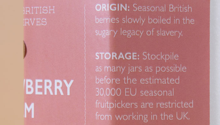
Food represents an important part of our everyday lived experiences, but also tells complex stories about provenance, processes and our own consumption behaviours that we aren’t always comfortable with. This range of Great British Classics looks at what the foods we love tells us about our shared history, culture and society. From the way our everyday products have been influenced by our trading history, to the quirky regional variations of our favourite dishes, to the rise in food poverty in the UK, this collection juxtaposes light observations alongside some serious commentary on the different ways we accept diversity, and the way we share our resources with others in the small print.
This high-end brand bridges the traditional and the modern, repurposing the aesthetic of Keep Calm and Carry On Britain for the luxury retail sector. Even when their flavours originate from elsewhere, these are ‘our’ beloved traditions – denoted by the centred use of Gill Sans, that most upper-case of British typeface institutions. The palette of sophisticated pastels hark back to better times, and make these preserves as suitable for display purposes as they are for spreading on toast.
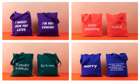
#SorryNotSorry Translation Totes
Brit’s don’t say what they actually mean! Each of these bespoke tote bags provide a handy translation of the hidden meanings behind indirect and vague British phrases and regional colloquialisms. Of course, some of this stems from ‘politeness’, the idea that we don’t want to cause offence or be too bold or forthright in our interactions with others. This may come from a positive place, but unwritten rules of communication and inferences can also be exclusionary, generating insecurity in those who don’t understand how to receive or translate the point.
These designs use a variety of different typefaces, to convey British visual eccentricity. The colour palette is understated but confident, while the simple slogan typography belies an unspoken complexity and confusion just below the surface.
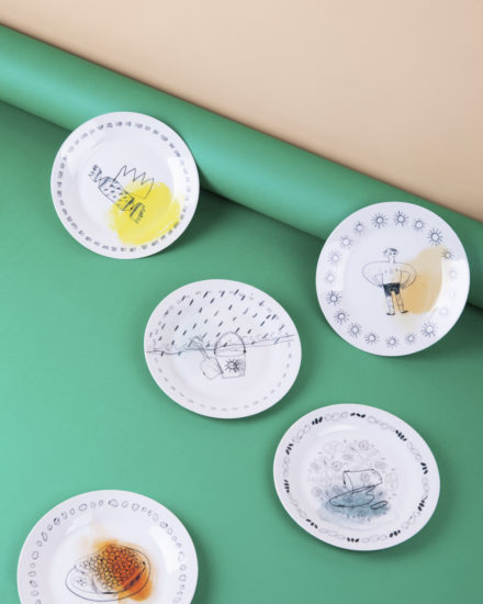
'Sh*t But Great' Commemorative Plates
Commemorative crockery usually marks an occasion relating to a historic event or the royal family: but ultimately they represent moments which you want to remember because they are really special. This series of 5 plates celebrates items or occasions which are embarrassing or clichéd, but nevertheless a much loved aspect of the British experience: Beans on toast; the paper hats in Christmas crackers; “Sun’s out guns out” (the embarrassing way Brits take their clothes off at the first glimpse of sunshine); the feel of the sticky pub carpet underfoot; a soggy day out at the seaside. None of these things are hugely noteworthy, but in their everyday, self-deprecating way they represent nostalgic creative comforts which invoke affection across regional borders, socio-economic backgrounds and political persuasions. They also point to the way in which the British sense of humour, eccentricity and irony is an important part of national pride.
This understated hand-drawn brand finds the beauty in the everyday. The muted colours mimic a palette of British weather – from Drizzle Grey through to Light Burn, with a smattering of Bang Yellow. The textural and handcrafted nature of the lettering and imagery combine for a limited edition look and feel that deserves pride of place on the mantelpiece. Illustrations by Peony Gent.
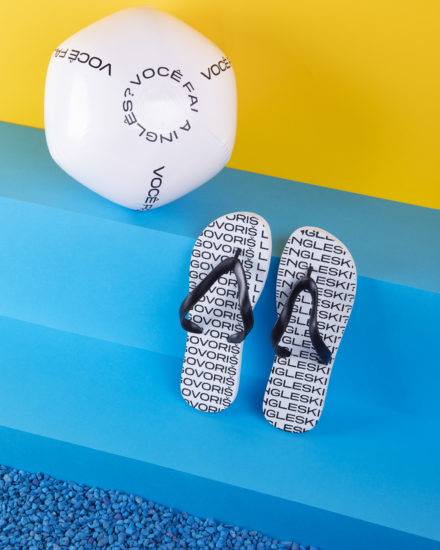
Brits Abroad Beach Essentials
There’s a cliché about Brits abroad… but the problem is the cliché is often true. This collection represents the hyperawareness in terms of how Brits are perceived overseas: too loud, too orange, too drunk, and either ignorant or lazy in grasping foreign languages and cultural norms. In response, many holidaymakers seek to actively challenge the stereotypes of Brits abroad, such as learning a few useful phrases before going somewhere new: represented in this collection as go-to phrases which might come in handy in key millennial holiday destinations. But in some cases, the sense of embarrassment goes deeper than being seen to act ‘appropriately’. Although not many millennials are consciously proud of our imperial history, do we remain overly reliant on being part of a dominant culture and language, and does this create a sense of entitlement abroad?
The binary colours and statement typography used in this brand emulate the loud and garish elements associated with Brits Abroad behaviour. The design nods to visual motifs used in reality TV shows and online fashion brands, while the extended and repetitive typography visually mimics the sounds of British attempts to communicate in a second language.
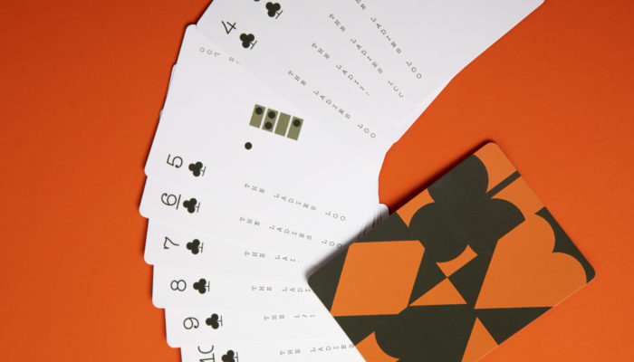
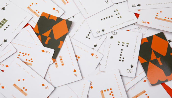
Social Queues
Is there anything less easy to navigate than the great British queue? Queueing isn’t as simple as it sounds: What’s right and proper on the tube just doesn’t work at the kebab shop. These designs, printed onto playing cards, explains the rules of the game. Each suit is based on an iconic queuing scenario – some more familiar than others – but everyone is expected to know the rules, and will be quietly punished (via a loud sigh or an eye roll) if you don’t.
This warm coral and dark khaki palette gives a much needed update to the traditional gambling red and black. The chequered motif and typewriter typography give this a more playful feel, while staying true to a British obsession with orderly wayfinding systems that rely on clear use of colour and shape to communicate without language.
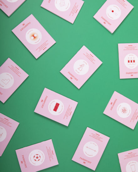
Personal Passports
These passports directly showcase the conversations we’ve had in the workshops and online focus groups, and via social media. While for some, Britishness is synonymous with social norms, for others, the concept of national identity invokes more uncomfortable reactions and criticisms of history and convention. From the pint glass to the school tie, these individual interpretations of Britishness allude to shared experiences, but also hint at what differs in attitudes towards Britishness.
Bypassing both the burgundy and the blue, millennial pink takes centre stage here, complimented by a bold red accent. Two icons of typography are combined – British Clarendon and Swiss Helvetica Neue, united here in their respective nations’ complicated relationships with the EU. Juxtaposing uniformity with diversity, this brand provides a framework for a series of clean, simple and individual coats of arms, fit for the 21st century.
JOIN IN
Start your own conversation!
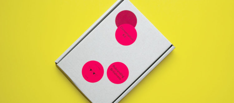
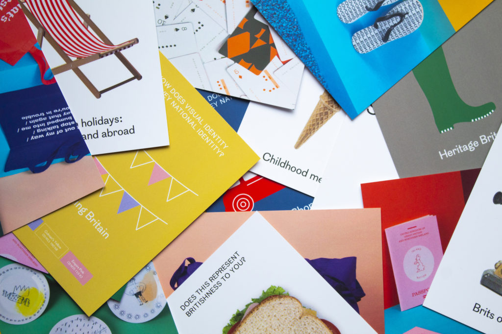
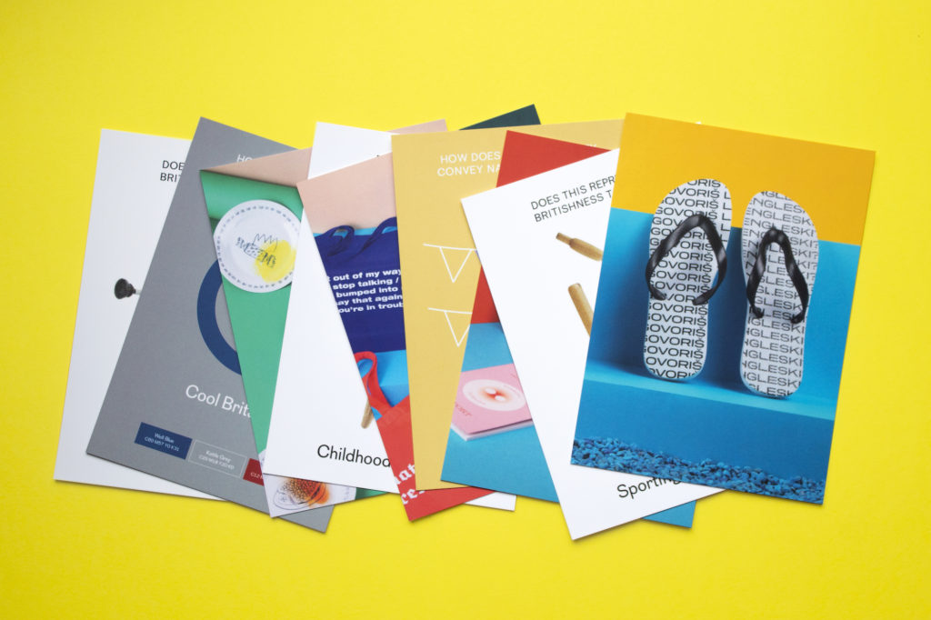
Using the insights and ideas from the #RebrandingBritishness project, we’ve created a Conversation Kit to stimulate further deliberative dialogue about what it means to be British. The kit encourages you to consider how debates about national identity are shaped by personal experiences, memories and shared language. Use the prompt cards, questions and guidance notes to have your own conversations about national identity and what Britishness looks like today.
We hope these materials will encourage lively conversations, along with thoughfulness, empathy and a creative mindset. The kits can be used by civil society groups, school teachers or university lecturers, or groups of friends looking for something to talk about in the pub!
Rebranding Britishness
More about the project
For over a year, Common Vision ran a deliberative consultation with millennials across the UK on what “being British” means today. Our participants were from different backgrounds and locations, voted differently in the 2016 EU referendum, and some were born in the UK and some were born elsewhere. But all agreed that a more positive, creative and inclusive approach to this conversation is possible and necessary.
We wanted to interrogate questions around the salience and importance of national identity in a post-Brexit world, and how millennials perceive national identity in relation to other personal and collective identities and affiliations to local places, globalised causes and issue-led communities. Rather than ask these questions directly, we began by asked participants to illustrate their ideas around identity, citizenship and belonging using meaningful objects which in some way represent their views and experiences.
We engaged a range of young people through crowdsourced methods, live events, and social media channels. Some of our focus groups looked at specific areas of lived experience using themes such as food, occasions, sport, music, or childhood memories, to provoke personal conversations rather than ideological interpretations of national identity.
We then extrapolated key concepts and threads from the individual inputs to develop a series of visual identities which represent modern Britishness. Naturally, ‘millennials’ are a broad and diverse bunch, so rather than one visual identity we wanted to showcase a portfolio of brands that convey contrasting perspectives, but also draw links between what different people have in common.
Each product range in the collection showcase one of these brand identities. They each tell a different and nuanced story, although there are elements which overlap.
Laura Gordon is a graphic designer. She is interested in how artists and designers can contribute to the public debate, particularly in relation to crafting new narratives (both verbal and visual) around British and European identities.
Find out more about Laura here: http://www.laura-g.co.uk/
With thanks to Sky Arts
This project is one of 50 artistic projects which will feature in a Sky Arts broadcast in March 2019. Sky Arts launched Art 50 to invite artists of all kinds, from all walks of life, from all artistic genres, to create a piece of work which says something important about what it will mean to be British after we leave the European Union.
Find out more at http://www.skyartsart50.tv/