The design of the Stronger In and Vote Leave campaigns spoke volumes, and their uncanny graphic similarity is a roadmap for what to avoid moving forwards. As the centre ground has seemingly disappeared from politics, maybe design should follow suit.
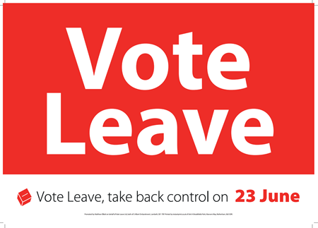
The campaigns for both Stronger In and Vote Leave were visually based around heavy use of ‘British’ colours (red/white/blue) and centred, modern, sans serif typography. The infamous £350million Vote Leave bus graphic was indistinguishable from some of the Stronger In campaign material. As a graphic designer I struggled to differentiate between opposing materials that came through the post.
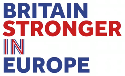
While visually similar, the subtle differences between the design languages of the campaigns provide insight into both their messaging and audiences. The Stronger In campaign opted for a more Great British Bake Off aesthetic, with Keep Calm and Carry On style typography. By comparison, the Vote Leave campaign visually alluded to a no-nonsense style public announcement, using clean vector-based graphics and little decoration.
Colour played a key role in both brand identities. Viewed through the colours of our party politics, Vote Leave’s liberal use of the colour red was aimed at the Labour heartlands. The red and white also speaks to the English St George’s Cross, not to the Union Jack of the United Kingdom, again spotlighting the demographic groups that were forecast to make the difference for the Leave vote. The Stronger In campaign used predominantly blue, with accents of white and red, referencing the colours of the Union Jack. This flag motif is also alluded to in the logo, where a red ‘IN’ is clad by a white border on a blue background, mimicking the geometry of the flag.
Stronger In’s heavy use of the flag references a Union Jack which was reinvigorated as a design icon during the London 2012 Olympics. This presumably aimed to position the Remain campaign as more visually patriotic, attempting to challenge Vote Leave’s positioning as the campaign of sovereignty and national pride. The use of blue by Stronger In also reached out both to Scotland and to Conservative voters. The Leave (majority Conservative) and Remain (majority Labour) campaigns swapped political party colours in an attempt to reach out to each others’ voters.
Moving forwards it is clear that we need new languages, both verbal and visual. Imitating these ‘proper’ campaigns and ‘proper’ parties is no longer the goal. These campaign and parties have contributed to a divisive political landscape. Now is the time for a multitude of new voices, approaches and ways of speaking. Following the referendum we need to be active, not reactive to those stoking fear of the other. We need to make our own stories, not reply to theirs. Just as we must not co-opt their rhetoric, we must avoid their design rhetoric too. Look to Podemos’ IKEA catalogue manifesto, and Britain Is Not An Island’s hand drawn campaigns for how to play with language and design to engage people on a different level. The outpouring of creative work in the lead up to the referendum must continue in the nuanced, contradictory and diverse way we have seen is possible. We need a less slick, less colour coded and less neutral design for Brexit. Or to put it actively, not reactively, we need an experimental, bright, opinionated and international design for Brexit.